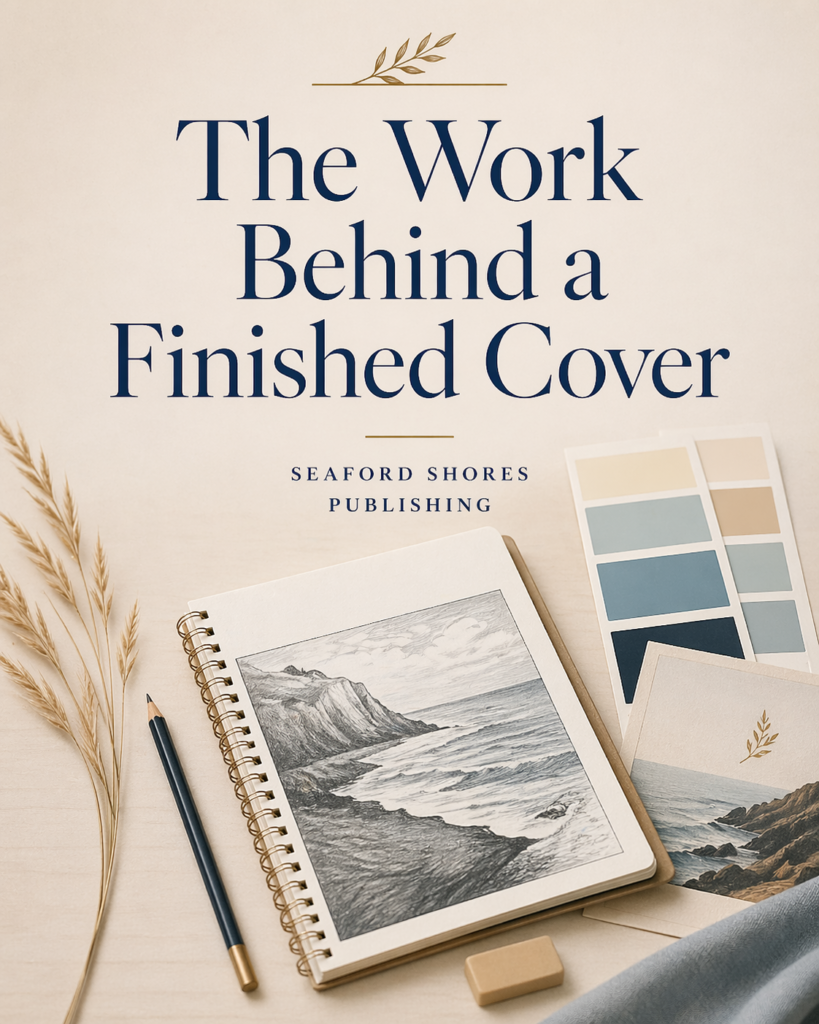
A finished cover looks easy once it is done.
That is part of the trick.
What the reader sees is a single image, a title, a name, a color choice, and a general impression. What they do not see is the long chain of decisions behind it. What belongs here. What does not. What tone the cover is setting. What kind of promise it is making before the book is opened.
A cover should not merely look good in isolation. It should fit the book. It should make sense at full size and thumbnail size. It should carry the right kind of weight. It should know whether the book needs sharpness, restraint, atmosphere, contrast, or plain clarity.
That takes thought.
Covers often go wrong when they become generic or when they try to force a mood that does not belong to the work. A strong cover does not need to explain the whole book. It needs to help the book meet the reader honestly and effectively.
At Seaford Shores Publishing, we take covers seriously because readers take them seriously, whether they admit it or not. The cover is not the whole book, but it is part of the reading experience before reading even begins. It sets expectation. It shapes curiosity. It tells the reader something about the judgment behind the work.
That is why cover decisions matter.
A finished cover may look effortless. Usually it is not. Usually it took trying, rejecting, revising, stripping things back, testing other directions, and asking again what the book really needs.
That is not wasted effort.
That is part of the work.